
Creating an axis based on a measure that is not in the view
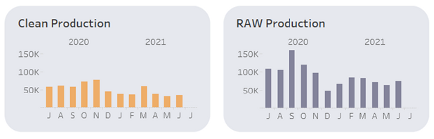
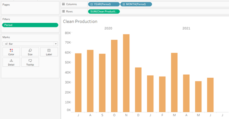
One of our clients wanted to see their finance and operations metrics over time. This included differentiating between Raw Production and Clean Production. The data had already been pulled and published to Tableau Online. The dashboard design was also set where each metric would be visualized in its own “card.” The first iteration looked like this: (data randomized to protect confidentiality)
The Problems:
- The axes aren’t uniform, making the Clean Production look just as high as the RAW Production upon first glance
- The bar graphs must be in two separate sheets to achieve the appropriate spacing for the design
- We can’t manipulate or pivot the data structure because it’s a Tableau Online live connection
Trust me, I know Tableau has some out of the box, easy ways to partially get there, like:
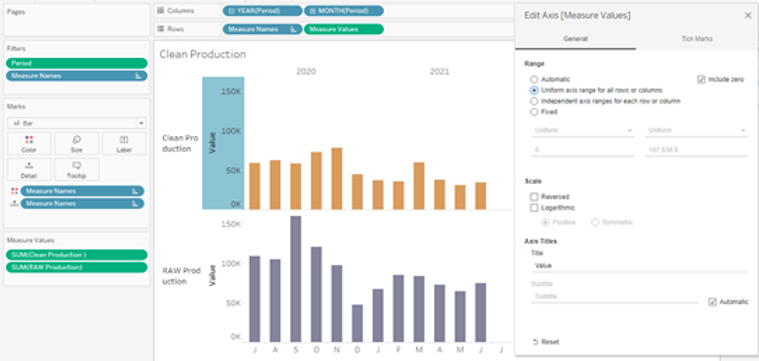
- Putting Measure Names and Measure Values on rows (or columns) and editing the axis to have a Uniform axis range for all rows or columns
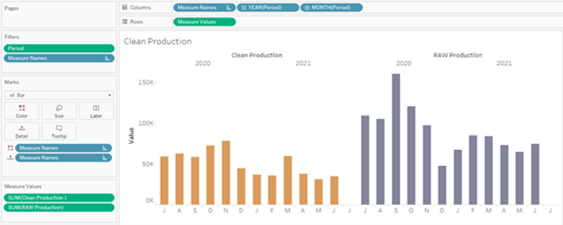
- Putting Measure Names on columns and Measure Values on rows (or vise versa) where they are represented on one axis that’s automatically unified
But alas, those methods weren’t feasible with this particular dashboard design. The charts required more spacing (i.e. two sheets, one for each measure). However, since Analytic Vizion strives to always deliver the best to our clients, we put our heads together for a solution to make it happen.
Here are some Tableau tricks we came up with:
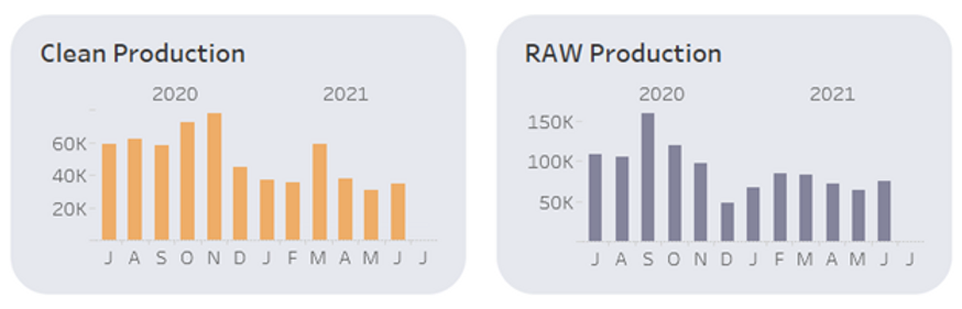
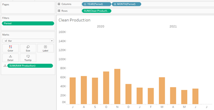
First, create the baseline view. We want the Clean Production axis to be relative to the Raw Production axis, so we’ll build the initial view with Clean Production as the foundation.
The Nathan way: Using a Reference Line
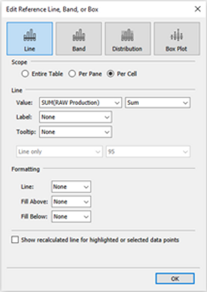
- Drag the measure you want to compare to (in this case Raw Production) to Detail on the Marks card
- Click the Analytics tab on the left-hand menu, drag Reference line onto the canvas, dropping it onto the Cell selection.
- Edit the new Reference Line dialog box as follows:
- Set to Line
- Scope: Cell
- Value: SUM(RAW Production)
- Aggregation: SUM
- Label: None
- Tooltip: None
- Formatting: all set to None
- Uncheck the “Show recalculated line” box
- Click okay and done!
The Jade way: Using Dual Axis
- Drag the measure you want to compare to (in this case Raw Production) to the rows shelf
- Right click the pill, select Dual Axis, right click again to Synchronize Axis
- Make sure the measure you want to show (in this case Clean Production) is in front (on the right side of the dual axis)
- Hide the axis header for Clean Production and edit or remove the title in the RAW Production axis
- In the Raw Production marks card (the one you want to hide):
- Set the mark to shape, with 0% opacity on color, and the smallest size setting
- Ensure tooltips are blank
- And done!

Both of these methods are quick and easy ways to create a relative axis that are “not in the view.” Choose your own adventure and enhance your Tableau dashboard designs!